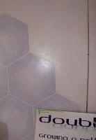
 So, still working on the Double Helix Cafe. I’ve imposed a deadline by entering the Fringe Festival, so now I must come up with some resolution! I decided to work it out a little differently than the first iteration. Still using 3 panels, but in a new configuration (mostly for easier moving of it). I’ve also made the panels match the packaging of the slides, which works much better. On the header panel, I’m hand painting the logo. Thank you Mike Bush for all the meanness in college teaching us how to hand letter. I did learn the importance of kerning and a steady hand, but I still think perhaps you didn’t have to be such an ass about it. Maybe just maybe you could have offered a couple of nice words now and then.. but then who’s to say, maybe your nasty ways is what worked.
 Had some trouble creating the reflected letters, but finally got it to work with a lot of glazing. Now I’m working on the red stripe in the logo. Will post a photo shortly.
The larger panels, I taped off and painted some nice crisp hexagons on, but I think I still need to glaze down the high key of the light purple. it’s just a little to stark still. I’m having trouble making a glaze work on such a large scale, I keep getting brush marks. If anyone has any thoughts or advice please send it my way.
